Crux Package Design
Crux Package Design
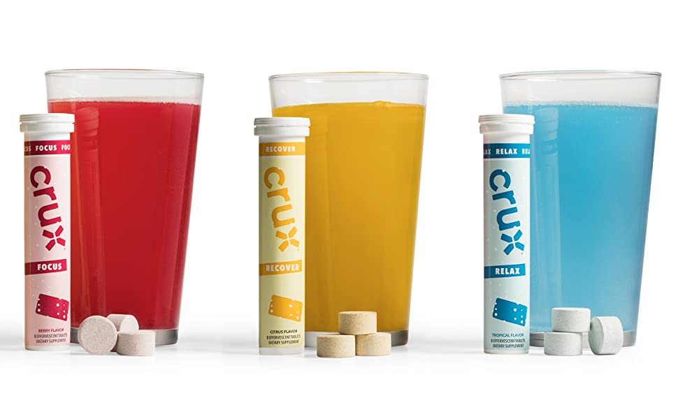
Crux produces functional effervescent tablets with formulas geared toward improving focus, promoting relaxation, and speeding recovery. This new brand had an existing logo, but needed a package design that stood out on shelf, explained what the product was, and clearly delineated flavors and functional benefits on shelf. We created a flavor-based, color-coded system with room for extension and featured illustrations of the tablets to show how the product worked.