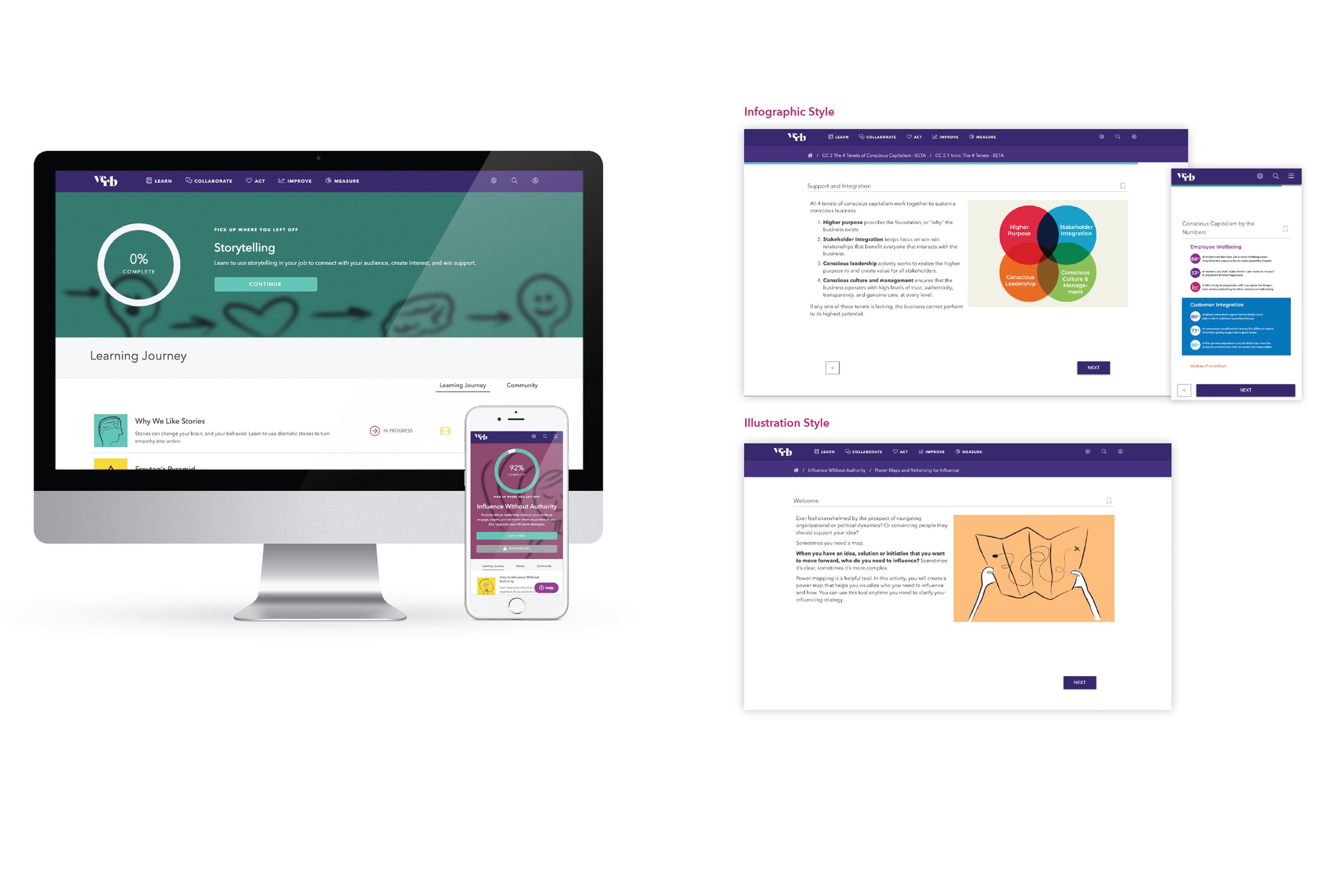
Verb branding
Verb specializes in offering online personal and professional development to companies large and small. Verb’s competitors all looked very similar—slick, corporate, and sterile. But the heart of Verb’s platform was very human—teaching soft skills like conflict resolution and mindfulness.
Verb already had a great logo, and bright pink signature color, which I thought worked for the brand ethos I wanted to create. To set them apart, I developed a system that built off these assets, but added human elements like hand-drawn illustration, wonky patterns, and whimsical set of creatures that came to be known collectively as Herbie the Verbie (see above).
I also added a friendly serif and a humorous copy tone that made the content engaging and respected and entertained the reader. We wanted copy that was smart and differentiated from the usual patronizing corporate-speak of your average workplace training module.
With the new brand launched, Verb was able to score a 4.5/5 stars with users, a 90% retention rate after 90 days, and an 80% completion rate for their learning modules.

Branding samples

Illustration samples

Learning modules

Client pitch materials

White paper: workplace learning

White paper: mentorship

White paper: growing leaders

Herbie wallpaper in the Verb office restrooms

Bandana

Investor proposal

Friends of Verb graphic