WorldStrides Rebrand
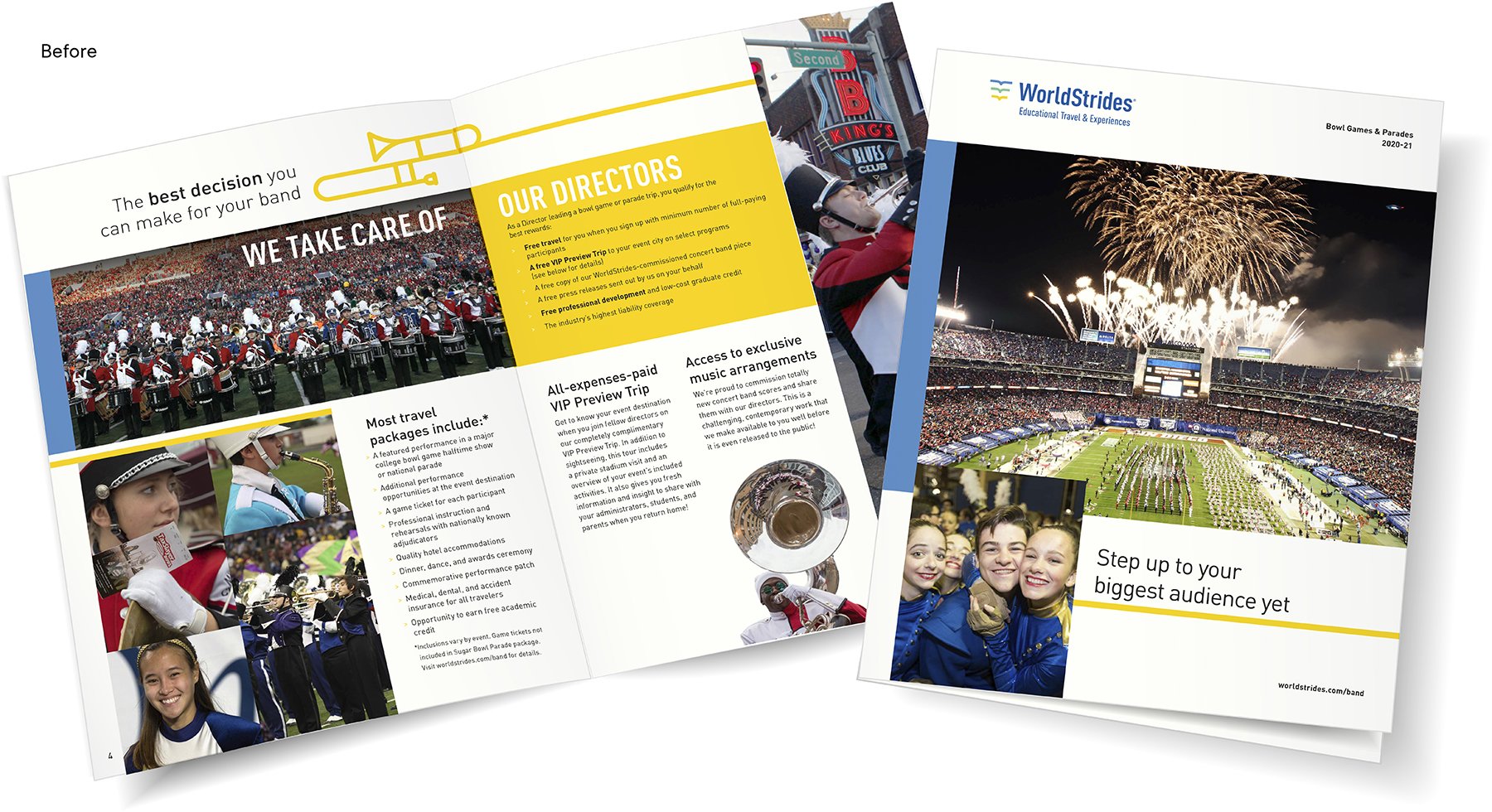
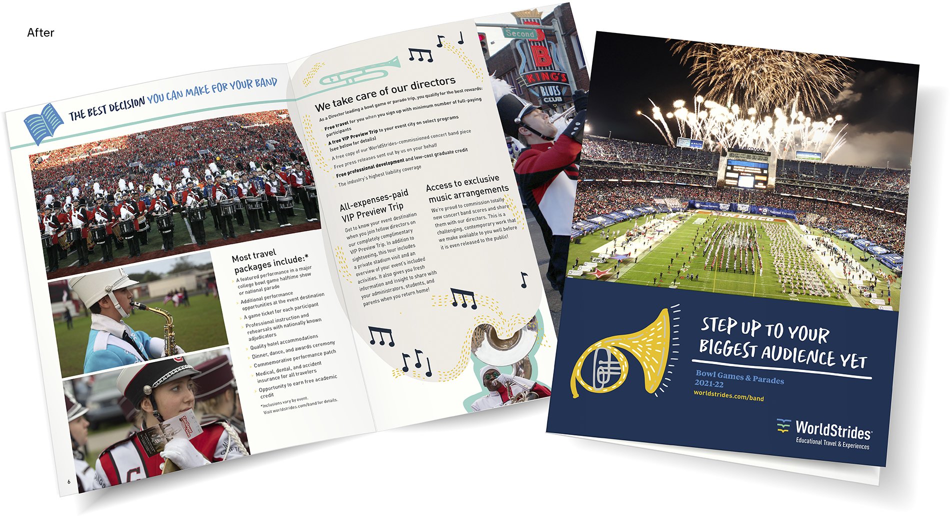
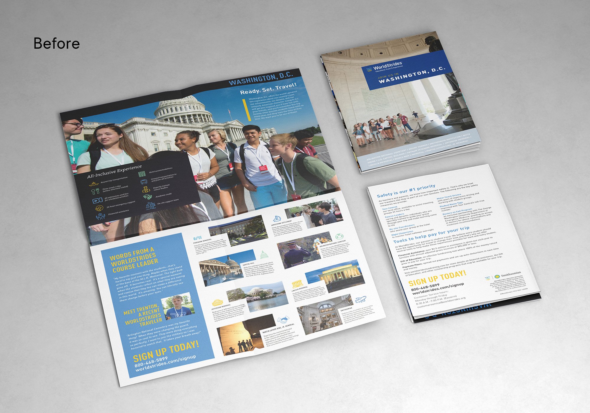
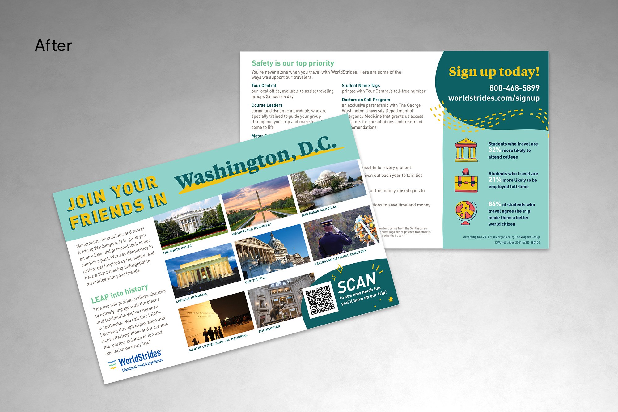
When WorldStrides, one of the largest student travel providers in the world, decided to bring all its disparate brands under a single brand architecture in 2019, they knew it would be a challenge. I was brought in to merge all the separate creative teams, update the brand standards, and bring brand consistency to all the lines of business. We started by refreshing the WS brand with a more modern, energized look and feel. The color palette was expanded, and we added a more whimsical illustration style to bring a sense of humanity to a brand that had felt a bit corporate and sterile.
Considering their products are incredible, once-in-a-lifetime experiences, it was necessary to incorporate more joy and play into the brand architecture, and we did that by breaking up the very geometric look with more organic elements. We then expanded these elements across all lines of business, while still maintaining the brand equity those companies had earned. The result was a refreshed look and feel that feels familiar and still trustworthy, but much more representative of the amazing products on offer.


Email design before
Email design after
Creative Director: Jill Visit
Creative Agency: WorldStrides in-house creative team